-
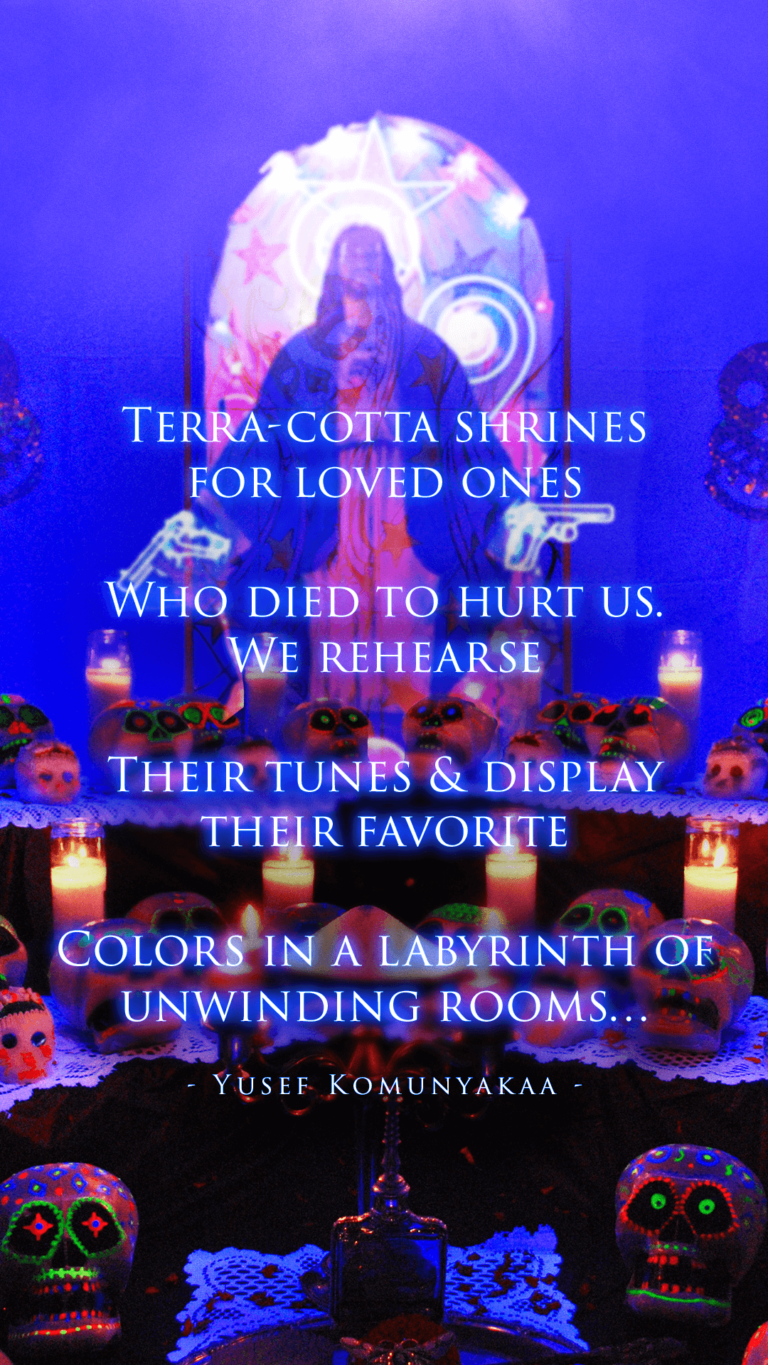
- Day of the dead

-

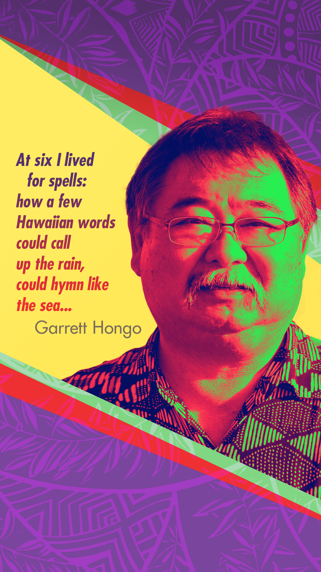
- Colorful queen

-
- Bull city legends

-

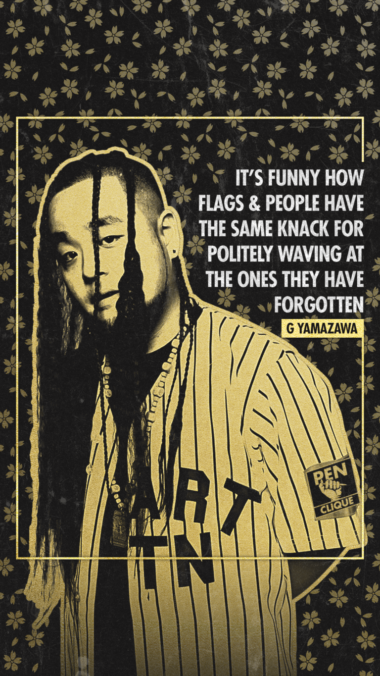
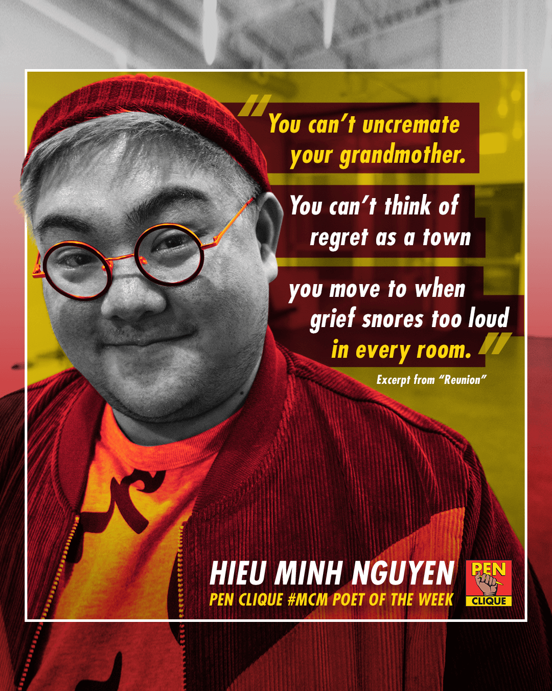
- Chaka to all bruddahs
-

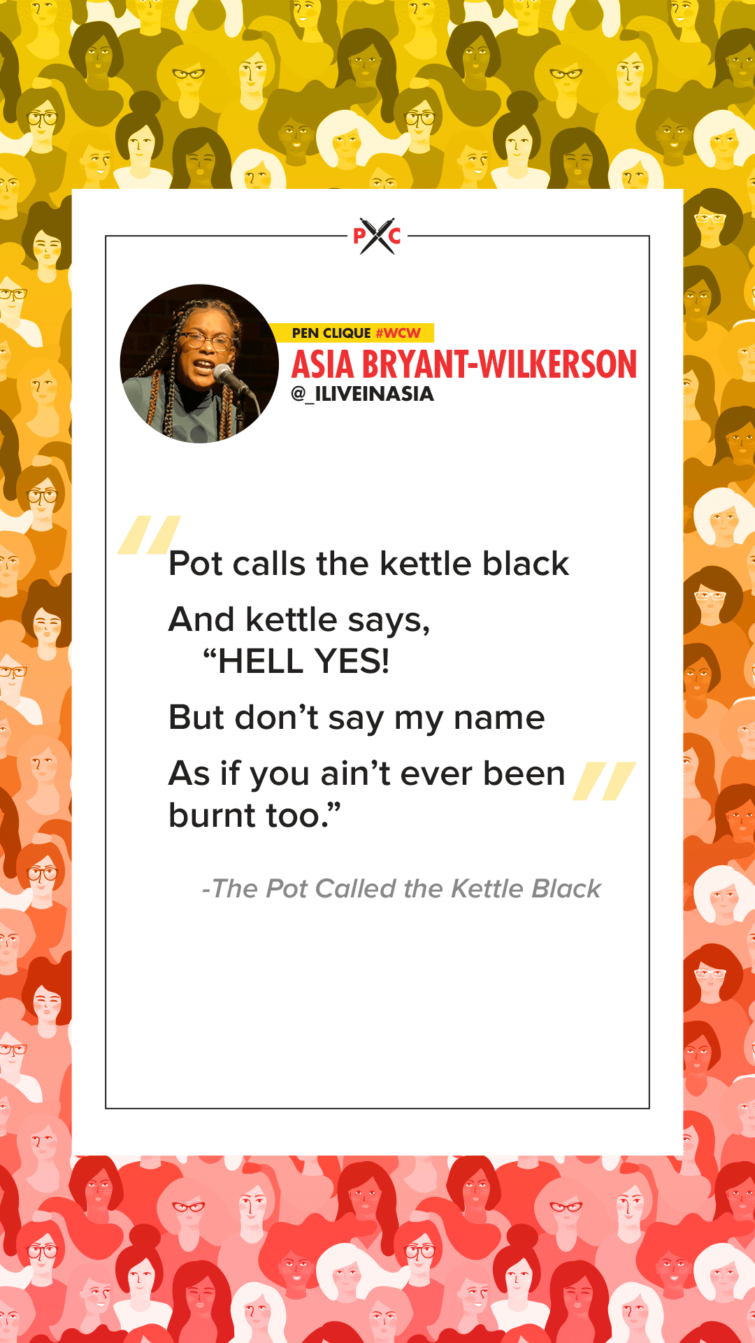
- WCW: Asia
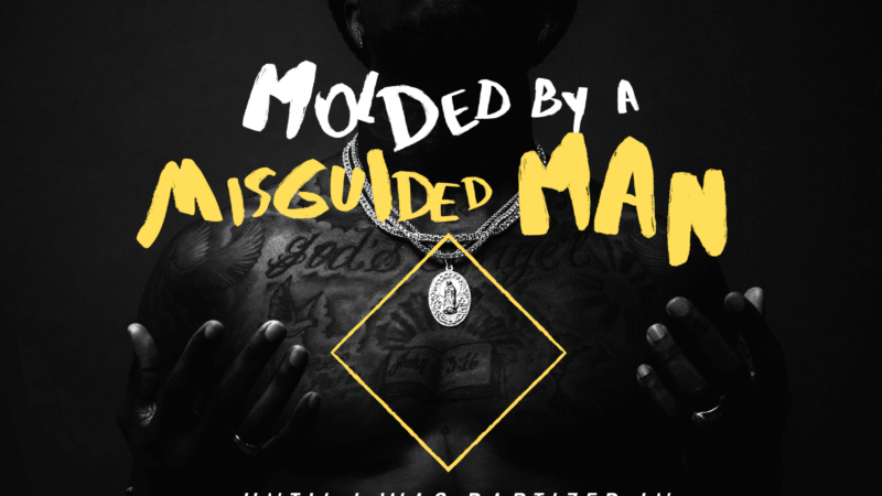
But all those wishy-washy aspirations are self masturbatory if you’re not helping other people to do the same. So in an effort to both reach out to the online IG poetry community and experiment with live-streaming a design-session, I put a call out on the Pen Clique IG story for a short poem to be turned into a visual piece. With a quickness, a young Baltimore poet by the name of @retro_tr submitted a firey excerpt from his poem:
I’m from Baltimore,
a place where bodies drop
like pennies
except, these ones
can’t be picked back up.Change isn’t something
you should look for here
This was a perfect poem to transform into a visual piece simply because of how visual it is. It references a place, objects, and movement; all of which can be expressed visually with the right type of assets. A good design is only as good as its assets, and the better assets you have, the less heavy lifting you need to do (think of illustrators who have to create everything from scratch, vs starting out with a good photo that only needs text on top of it).
IMPORTANT NOTE: If you’re looking to make your visual poem into something you can sell, by law, you must use either royalty-free stock images or your own original images. But since this is JUST for the gram (and the culture), Google images is fine.
The tutorial in the video pretty much covers the whole design process, and even shows the non-sexy side of design like clipping out images, color correcting images to look like they’re “in the same room”, trashing ideas to pursue better solutions, etc. If I could do it over again, the one thing I would’ve changed was to move everything up by 10-20 pixels because the by-line at the bottom added a little more bottom-weight to the composition. Another thing I would’ve experimented with might’ve been adding a little color to the text, maybe slightly off white with a red/brown pull to get a feel that it’s in the copper world of the design. But white ain’t that bad either, especially to stick out and be read.
![]()
But overall, I’m alright with the end result. Some things could’ve been cleaned up and tightened, but for the sake of keeping the live stream short (by the time we got to the above result, the live stream had already ran an hour long!), I got it to a passable point. Also gotta remember that this is strictly for the gram, so chances of people just scrolling past it is high, so as long as all the essential elements were in there (poetry, pennies, bullets), then we’re good.
If you wanna check out the build file, you can download the zip file here. It’s a Photoshop file; if you don’t have Photoshop (which if you’re trying to be a designer, you absolutely need it) and just wanna play around with design, GIMP is a free option that can also open Photoshop files as well.
I’m hoping to make this a bi-weekly thing for the non-episode weeks, so be on the lookout by subscribing to Pen Clique on YouTube or on Instagram where we’ll be making all our live stream announcements and posting all the visual poetry we come up with. Stay creating, poets.
~Kuya David
-
Poetry “Slam” In The Quarantine Era
Virtual open mics and slams via IG live: Not great. The video quality, audio quality, lack of atmosphere, and most importantly the live aspect are all stripped away. My question is: What would the ideal digital open mic and slam look like in the quarantine era?
-
(Re)Introducing: The Poetry Clash
Is poetry slam the end-all, be-all spoken word competition format? Five years ago we tried to address this, but would soon leave the idea to pursue building the Pen Clique podcast. But with lock-down giving us ample time to develop ideas, it’s time we reintroduce to the world: The Poetry Clash.
-
Tutorial: Intro To Making Poetry Posters With Canva
Ever wonder how to make a visual poem, but didn’t know where to start? Is it even worth learning to do? In this article, we show you how (and why) we made a whole visual poetry poster FOR FREE with Canva.