The tutorial video is up top, so if that’s all you came here for, we got you. If you have any questions, please click through the video and ask them in the YouTube comments so all the questions can be found there. But if you wanna know the why we think you should be making visual poems, it’s because:
The game has changed.
With the internet allowing poets to publish their work anywhere and at any time, it can seem impossible to make your voice heard within the behemoth that is the online public. On Instagram alone, the hashtag for #poetry gets over 38 million hits A DAY. Majority of those posts are simple black text on white backgrounds (probably screenshots off their notes app), which can easily get lost in that ocean of pixelated poems.
But with Instagram, Facebook, YouTube, TikTok and Snapchat all being visual platforms, it only makes sense to provide those audiences with what they came to those platforms for: captivating content with equally captivating visuals. Because on these visual-centric social platforms, the book covers are the content.
Yes, poetry & art are ultimately about self-expression, but if you’re trying to support yourself off of your craft, now you’re in the product game. The main advantage visual poems have over books & chapbooks is that they’re much easier for people to casually buy into. It’s significantly easier for people to consider buying a $7 postcard print of a pretty visual poem vs a $20 chapbook that might be trash inside. Granted, there’s still a market for amazing poetry collections of course. But in this day and age where we have free tools to make all types of poetry media, why not diversify your offerings and let people buy your poetry however they want to; be it books, posters, apparel, etc. The only limit is your imagination… and your know how.
There's levels to this.
Alright, so visual poetry is the wave. But how do you get in? You spent your life perfecting your poetry, but aren’t sure how to incorporate it with visual art. Maybe you don’t even have an artistic bone in your body (apart from your words). No worries; there’s many levels to visual poetry. Some of which you can easily start practicing right away. But the more complex it gets, the more study and practice it will take to express yourself visually. Just like poetry, the more you practice, the more familiar you’ll get with the tools and the devices, the better you’ll be able to express yourself.
In the above video, we go over the multiple levels of making visual poems. On the bottom end, you got quick-and-dirty ways like taking screencaps off your phone, or simply typing over a photo you take on IG stories. But there comes a point where you can’t escape having to learn design. Luckily, that’s easier than ever now with free design apps like Canva and free stock photo libraries like Unsplash.
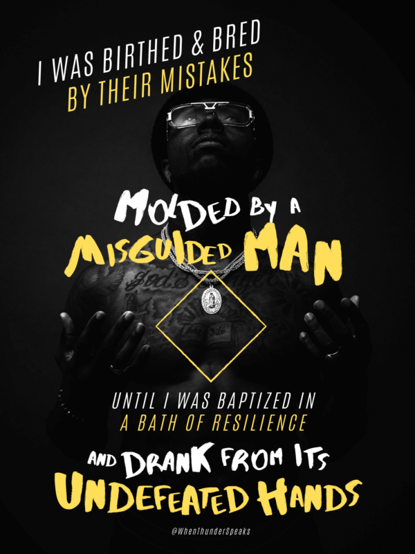
Without a doubt, you can pull off some solid “Level 3” pieces with them, which is what this first Canva tutorial video is about. In fact, Levels 1.5-3 are actually good enough for majority of your social-media poetry posting needs. Unless you have all the time in the world, or really wanna make visual poems your thing, there’s no practical reason to make every piece you publish a Level 5. In fact, one YouTube commenter asked about this very thing:
To which I replied in the thread:
Great questions, all of which I'm sure many poets are wondering as well. IN FULL HONESTY, level 5 is a matter of experience and craftmanship; there's no short-cut way to it. You can get lucky, but if you wanna make consistent level 5 pieces, you'd have to know what you're doing; there's two avenues to this: craft and creativity. Craft is the technical knowledge, like how to clip out a photo, how to make lighting look a certain way, how to color correct, etc. Creativity is the art side of it, like how do I make this scene look happy? How do I convey sorrow? Etc.
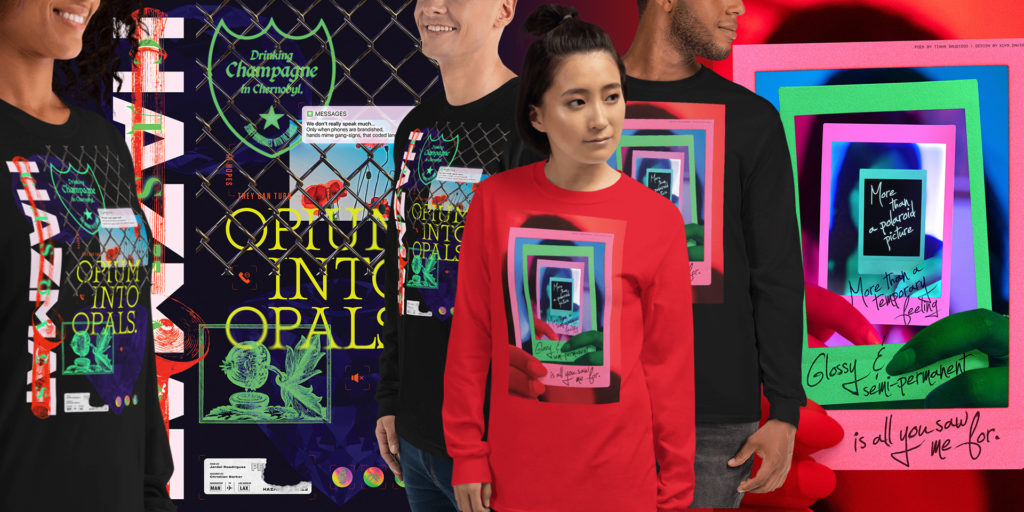
In regards to whether level 5 would be overwhelming for every post on IG - depends on your free time. If you're a student and got a lot of free time, by all means, swing for the fences. Because there are art IG pages that post nothing but their best work. They build their names off of their dope art, and the "better" (subjective) it is, the higher chance ppl will share your work. The problem is, in practice it's difficult. Even just making a solid Level 2 or 3 piece takes a couple hours. Instead, what I think should happen is aim for Levels 1.5 - 3 for social; because spicing up your poetry with good visuals is all we're looking to do to give value to both your work and to the audience. Level 4-5 IMO should be for your MERCH. Posters, shirts, tote bags, mugs, book covers, etc. Save the best for something you can sell, to make it worth your time. Maybe make a level 5 piece here or there for social to advertise that you got it like that, but to be more strategic with your time, level 5 for EVERYTHING is a bit of a waste of your own personal time (unless you got time to burn).
Lastly, if you wanna see what making level 5 pieces looks like, be sure to check out the time lapse videos from the Poetry Art Gallery. Those show how much effort goes into them. Some of those pieces were made in multiple sessions over 2 or 3 days:
Got it. So how do I do this?
Well, at the top of this article is the tutorial video. But if you really don’t feel like scrolling up, here it is again for your learning pleasure:
NGL, this was my first time using Canva to this degree of design. I’ve done a bunch of quick and dirty graphics with Canva before, but making a whole poster with Canva was something I never though about doing because as a professional designer and art director, like the rest of my industry, I use Photoshop (and the rest of the Adobe suite). I actually tried doing a similar tutorial last year, where I was casually using Photoshop as per my usual work flow.
What I didn’t realize was that the average poet:
- Doesn’t own Photoshop
- I was using advance techniques that I didn’t bother explaining how to do (because it’d take forever)
- I was using paid stock images from my personal library
- There was essentially no way a non-designer could follow along
In our mission of building the market for poetry by both showing & proving to the public that we can produce dope poetry content, and empowering poets by leading them with new ideas of presenting poetry, that Photoshop tutorial did nobody any favors. In fact, it might’ve done the opposite and made poets think, “Well if I don’t know or have Photoshop, then visual poetry must be impossible.”
This year, we’re going to focus on doing more tutorials with the needs of an average poet in mind. From using free design tools, free asset resources, making social posts, designing shirts, etc; we’re going to try to approach our tutorials assuming that whoever’s watching has never made a graphic in their life.
That being said, we’ll need some action on your part:
- We’ll need you to subscribe to our YouTube so you can ask your questions in the comments section for us to answer. Your questions will inform us what techniques to teach or what styles to produce on the next video.
- We need you to follow us on Instagram so when we do a poetry prompt call for submissions, you can submit your own short poems and show you how we can take even your words and make them into a visual piece.
Thank y’all for making it to the end of the article; I hope this brought you some value and insight. I hope by the end of the year we’ll have all of yall, the entire Clique, on this visual poetry wave. I would LOVE for our social feeds to be filled with your art works. Can’t wait.
~Kuya David
You Might also like
-
How (and Why) We Built a Podcast Studio
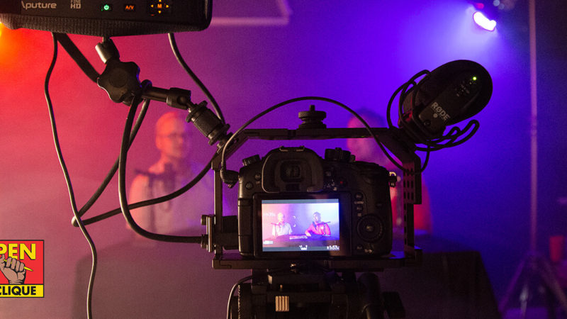
WE’RE BACK! During our hiatus, we’ve been building a whole podcast studio to record audio, AND shoot both video & photos, as well as upgrading our podcast gear, all in prep for the relaunch on July 10th, of the most poppin poetry podcast in the GALAXY! (Purchase links included to all gear)
-
Creating a Memorable IG Live Experience
Instagram Live can be pretty hit or miss. But what makes it miss? In this video we identify the weakness of IG Live and how we can imrpove upon them.
-
(Re)Introducing: The Poetry Clash
Is poetry slam the end-all, be-all spoken word competition format? Five years ago we tried to address this, but would soon leave the idea to pursue building the Pen Clique podcast. But with lock-down giving us ample time to develop ideas, it’s time we reintroduce to the world: The Poetry Clash.
