-
Poetry “Slam” In The Quarantine Era
Virtual open mics and slams via IG live: Not great. The video quality, audio quality, lack of atmosphere, and most importantly the live aspect are all stripped away. My question is: What would the ideal digital open mic and slam look like in the quarantine era?
-
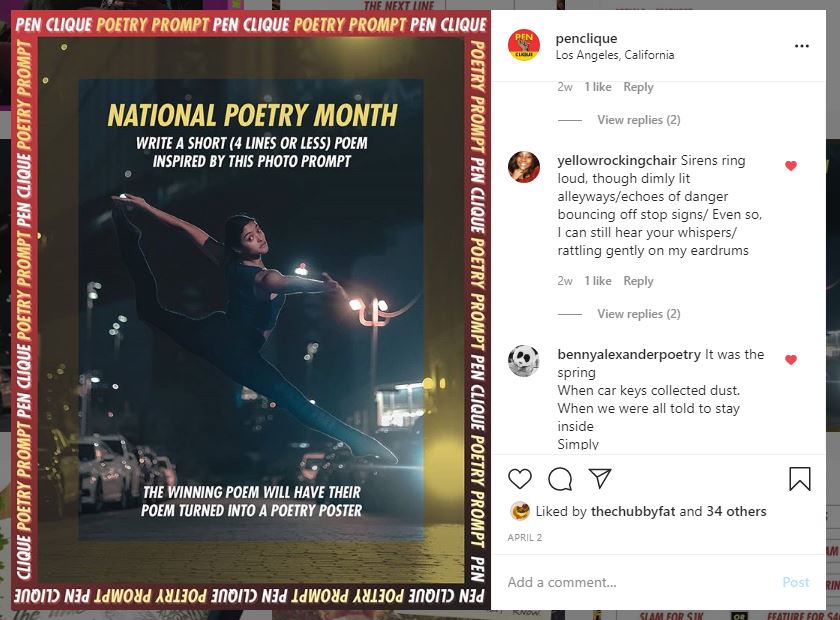
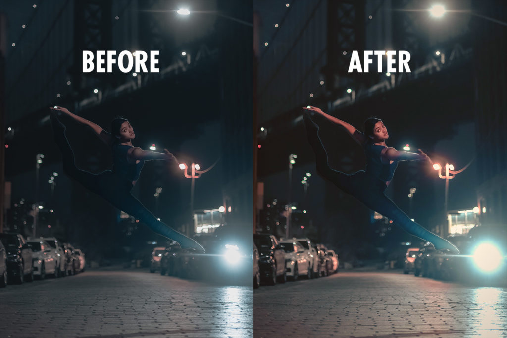
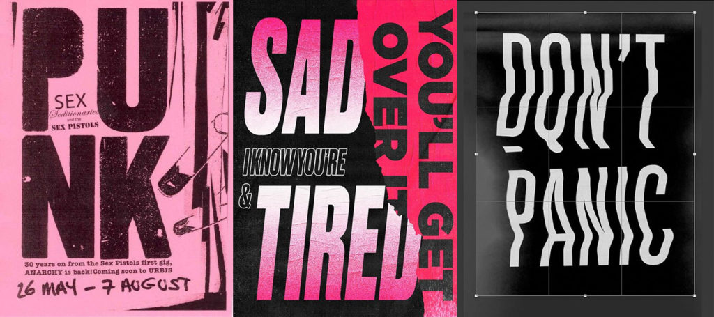
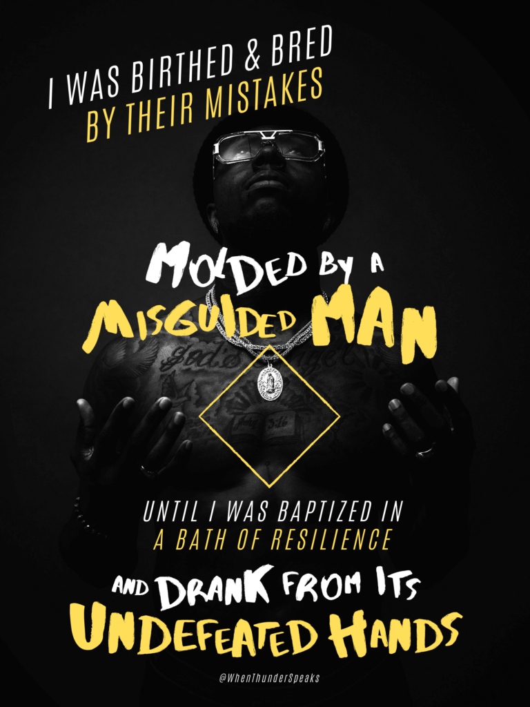
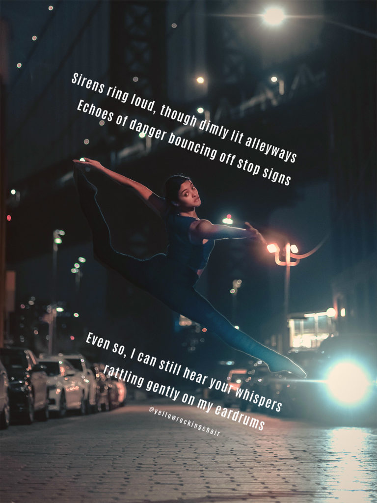
Tutorial: Intro To Making Poetry Posters With Canva
Ever wonder how to make a visual poem, but didn’t know where to start? Is it even worth learning to do? In this article, we show you how (and why) we made a whole visual poetry poster FOR FREE with Canva.
-
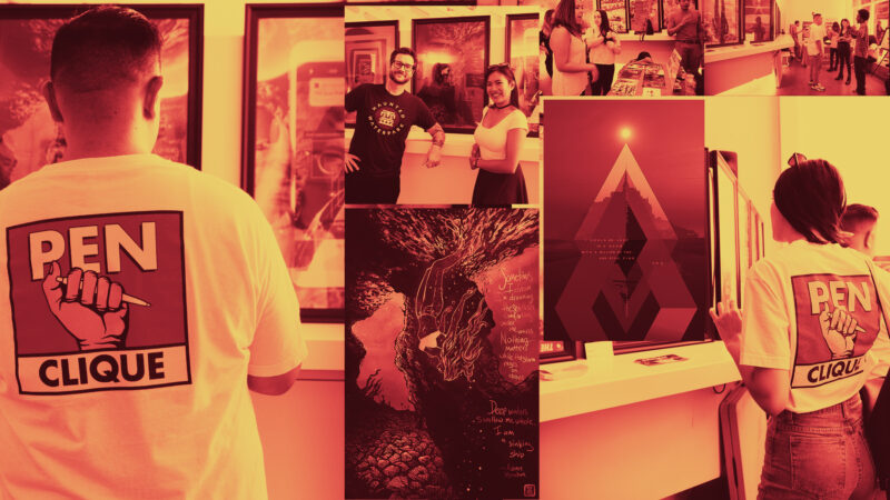
The Poetry Art Gallery: A Look-Back One Year Later
It’s been a year since producing Los Angeles’ very first poetry art gallery. It seems that even till today I’m still marinating on the event, but here’s what I can admit and reveal about our (overly?) ambitious project, The Poetry Art Gallery.